Typography is the balance and interplay of letterforms on the page, a verbal and visual equation that helps the reader understand the form and absorb the substance of the page content.
Typography plays a dual role as both verbal and visual communication.
As readers scan a page they are subconsciously aware of both functions: first they survey the overall graphic patterns of the page, then they parse the language, or read.
Good typography establishes a visual hierarchy for rendering prose on the page by providing visual punctuation and graphic accents that help readers understand relations between prose and pictures, headlines and subordinate blocks of text.
Text typographY | Readability and legibilitY | Display TypographY | kinds of typefaces
Principles of Typography |Typography Tips and Techniques | CHARACTER PANEL
Principles of Typography |Typography Tips and Techniques | CHARACTER PANEL
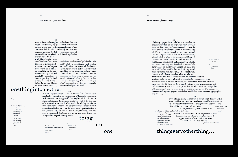
In traditional typography, text is composed to create a readable, coherent, and visually satisfying whole that works invisibly, without the awareness of the reader. Even distribution with a minimum of distractions and anomalies are aimed at producing clarity and transparency.
Choice of font(s) is perhaps the primary aspect of text typography—prose fiction, non-fiction, editorial, educational, religious, scientific, spiritual and commercial writing all have differing characteristics and requirements. For historic material, established text typefaces are frequently chosen according to a scheme of historical genre acquired by a long process of accretion, with considerable overlap between historical periods.
Contemporary books are more likely to be set with state-of-the-art seriffed "text romans" or "book romans" with design values echoing present-day design arts, which are closely based on traditional models such as those of Nicolas Jenson, Francesco Griffo (a punchcutter who created the model for Aldine typefaces), and Claude Garamond. With their more specialized requirements, newspapers and magazines rely on compact, tightly-fitted text romans specially designed for the task, which offer maximum flexibility, readability and efficient use of page space. Sans serif text fonts are often used for introductory paragraphs, incidental text and whole short articles. A current fashion is to pair sans serif type for headings with a high-performance seriffed font of matching style for the text of an article.
The text layout, tone or color of set matter, and the interplay of text with white space of the page and other graphic elements combine to impart a "feel" or "resonance" to the subject matter. With printed media typographers are also concerned with binding margins, paper selection and printing methods.
^TOP^
Readability and legibility are often confused. Readability is most often and more properly used to describe the ease with which written language is read and understood – it concerns the difficulty of the language itself, not its appearance. Factors that affect readability include sentence and word length, and the frequency of uncommon words.
In contrast, legibility describes how easily or comfortably a typeset text can be read. It is not connected with content or language, but rather with the size and appearance of the printed or displayed text.
^TOP^
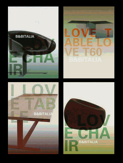
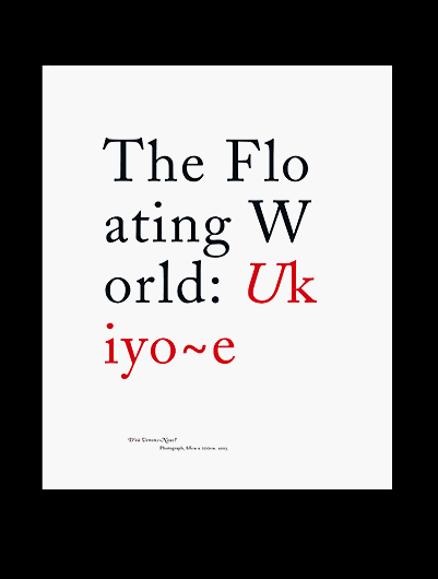
Display typography is a potent element in graphic design, where there is less concern for readability and more potential for using type in an artistic manner. Type is combined with negative space, graphic elements and pictures, forming relationships and dialog between words and images.
Color and size of type elements are much more prevalent than in text typography. Most display typography exploits type at larger sizes, where the details of letter design are magnified. Color is used for its emotional effect in conveying the tone and nature of subject matter.
Display typography encompasses:
- posters; book covers;
- typographic logos and wordmarks; billboards;
- packaging; on-product typography; calligraphy;
- graffiti; inscriptional and architectural lettering;
- poster design and other large scale lettering signage;
- business communications and promotional collateral; advertising;
- wordmarks and typographic logos (logotypes),
- and kinetic typography in motion pictures and television; vending machine displays; online and computer screen displays.
Sans Serif Typefaces - Sans Serif typefaces do not have finishing strokes at the ends of the letterforms. The name comes from the French word sans, which mean "without." Sans Serif typefaces are also referred to as Gothic. Avante Garde, Helvetica, and Arial are the most common Sans Serif typefaces.
Serif Typefaces - Serifs are lines or curves projecting from the end of a letterform. Typefaces with these additional strokes are called Serif typefaces. They are also referred to as Oldstyle typefaces. Times Roman, Palatino, Bookman, and New Century Schoolbook are common Serif typefaces.
Script Typefaces - Script typefaces simulate handwriting, with one letter connected to another visually, if not physically. Script typefaces emulate several different types of hand-lettering, including calligraphic, drafting, and cartoon. Zaph Chancery and Brush Script are common Script typefaces.
Character Fonts - Character fonts are extended character sets packaged as fonts. To view the character font sets on a personal computer, open the Character Map file in the Accessories folder to view a grid of all of the characters for a specified typeface. Click on the character you want to use and either note the keystroke displayed in the box in the lower right corner of the window or copy and paste it into the publication where you want to use it. Wingdings and Dingbats are common Character fonts.
Decorative Fonts - Decorative fonts are fonts that do not fit into any other group. These typefaces are reserved for novelty, for special effect, or a special approach. Because they are different, they are usually harder to read than standard fonts, so use them sparingly and always as display type - never as text. Beesknees, Curlz, and Snap are examples of decorative fonts.
^TOP^
Type Size - Type is measured by its vertical height, in points. There are approximately 72 points in an inch, so 72-point type is approximately 1 inch in height on a printed page. 36-point type is approximately ½ inch in height, and 18-point type is approximately ¼ inch in height. Text on a printed page is usually 10 -12 points in size. Any type below 9 points in size is very hard to read.
Weight - Weight refers to the density of letters, the lightness or heaviness of the strokes in a typeface. It is described as a continuum: light, regular, book, demi, bold, heavy, black, and extra bold. These weight descriptions are used in font names to describe the thickness of their lines. Light fonts are composed of the thinnest lines and extra bold fonts are composed of the thickest lines. Not all weights are available for all typefaces and the continuum occasionally varies in some typefaces.
Style - Style refers to options such as bold, italic, underline, and reverse, that you can choose as part of your type specifications.
Leading - Leading is the vertical space between lines of type. It is measured in points and is expressed as the sum of the type size and the space between the two lines. Generally, it is at least the size of the type. Type with a generous amount of space between lines is said to have open leading and type with relatively little space between lines is said to have tight leading. Some software programs, including all desktop publishing programs, allow users to adjust leading.
Alignment - Alignment refers to the shape of the text block in relation to the margins. Most software programs allow left alignment (sometimes called flush left), right alignment (sometimes called flush right), center alignment, justified alignment, and force justify alignment.
The Color of Type - Even when printed in black and white, all type has a color on the page. Color here means the overall tone or texture of the type and the lightness or darkness that varies among typefaces and spacing of type.
- Determine the image you want to project with your publication and choose fonts with personalities that will fit that image.
- Limit the number of typefaces you use in a publication. Many experts say to use a limit of two typefaces, but occasionally this will vary.
- Too many typefaces can create an unprofessional, jumbled image.
- Look at various publications for ideas about which typefaces work well together and the images they project.
- When using two typefaces, make sure they are very different. One typeface will probably be used for display type, such as headings, and the other for text. Strive for definite contrast between the two.
- When choosing only one typeface family, choose one with a lot of variations, so you will have some flexibility with your text design. The typeface Helvetica has many variations such as Helvetica Bold, Light, Regular, Condensed or Narrow, Outline, and Black.
- If you are unsure about which typeface to select, choose a common and reliable one such as Garamond, Palatino, Helvetica, Goudy, or Times Roman.
- When using a display type that has very strong characters (type that is bigger and bolder than regular type), use a typeface for text that looks more neutral. Very elaborate typefaces can be hard to read. Limit their use to only a few words and make sure the words are legible.
- All caps are harder to read than upper and lower case letters. Try to limit the use of all caps to two or three words. Some typefaces, such as Old English, are not designed to be used for all caps.
- Use bold and italic type for just a few words.
- Avoid setting large blocks of text in bold or italic type. Both styles are generally more difficult to read than regular type. A block of bold type tends to darken a page.
- Typeface weight will have a large impact on the color or darkness of your page. Thin lines will create a light and airy appearance, while thick lines will create a dark and heavy appearance. Weight can be very important to the image of a publication.
- Different typefaces take up different amounts of space. Some fonts are larger and take up more space per letter. This can greatly affect the length of a publication.
- The reader's eye is attracted by white space. It gives the eye a rest and calls attention to what it surrounds.
- Break multi-line headings by phrase (where a spoken pause would occur). Place more white space above heading than below. This signals the reader that the heading goes with the text below it.
- Increase the spacing between lines or leading to create a lighter-looking page.
You use the Character panel (Window > Type > Character) to apply options for formatting individual characters in your documents. When type is selected or when the Type tool is active, you can also use options in the Control panel to format characters. You can find many of these same controls and options in the Control panel when your type is selected.
Definitions:
Kerning is a term applied specifically to the adjustment of spacing of two particular characters to correct visually uneven spacing
Tracking refers to the amount of space between a group of letters to affect density in a line or block of text.
Leading refers to the amount of added vertical spacing between lines of type.
Baseline Shift moves selected characters up or down relative to the baseline of the surrounding text. Shifting the baseline is especially useful when you’re hand-setting fractions or adjusting the position of a picture font.
^TOP^
TYPOGRAPHY EXAMPLES:
Text typographY | Readability and legibilitY | Display TypographY | kinds of typefaces
Principles of Typography |Typography Tips and Techniques | CHARACTER PANEL
^TOP^
REFERENCES:
http://www.online.tusc.k12.al.us/tutorials/typograp/typography.htm#typobas
Brady, P. (1988). Using Type Right. Cincinnati, OH: North Light Books.
Burke, C. (1990). Type from the Desktop. Chapel Hill, NC: Ventana Press.
Shushan, R. and Lewis, L. (1995). Desktop Publishing by Design. Redmond, WA: Microsoft Press.
Williams, R. (1998). The Non-Designer's Type Book. Berkeley, CA: Peachpit Press.